Tuesday, 23 February 2010

In the news


I was looking around on the bbc news website this afternoon, as I am on top of my work I seem to have this thing called 'spare time' and I don't really know what to do with it, so I thought I'd see what was happening in the world.....

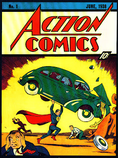
It turns out that there is actually something interesting that has happened that interests me, a copy of the first comic to feature caped hero Superman has been sold on the internet for a whopping $1m!! (£646,000)

The 1938 edition was originally said to be sold at a mere 10c, to a private buyer, and this recent sale has broken the previous record of $317,200 (£205,000) in 2009.
To me, and probably a lot of people, this is a huge amount of money for one comic?! I don't care if it is original, or a one off or whatever it is, that to me is just funny money! Someone who has more money than sense! Think of what else this money could be spent on? I am a big believer in bargain hunting, I love a good bargain and I find it very hard to spend a lot of money on single items alone, the most expensive thing I've probably ever bought, discounting my car and laptop, was a winter jacket which was about £80 and to me that is still expensive!! I know people say well its only more expensive because its better quality, which is true in most cases but I don't care how good the quality is of a handbag for example when I can get one for half the price that does the exact same thing!

Anyway, what I think should have been done with this particular piece is, instead of someone paying a ridiculous amount of money for it and them being the only ones to get any pleasure out of it for it to be bought by a gallery of some sort and the money used to keep it in its current condition I'm sure will be nothing compared to what was spend buying it, and this way it is for everyone to enjoy.

Mr Stephen Fisher, co-owner of the US auction website Comic Connect, said it was "the Holy Grail of comic books."

If it is such an incredible piece of art work and apart of our history of comic stripes then lets show it off for all to see, and for younger generations to look at and admire, instead of one man/woman buying it and framing it on their wall.


Thursday, 18 February 2010

Activity 2

So for our second activity of semester 2 we were to gather together a random selection of 3 images and hand them out to several people to see if they could make a connection between the 3 in the form of a short story. I used the website www.sxc.hu to generate my random images.


The stories I got from my first experiment are:

Female/52/unemployed
The little girl is on the beach, looking back at the promenade, as she scans along she sees the empty deck chairs with no one sitting on them and at her eyes move towards the end of the prom there is a bike sitting at the end of the wall.

Female/16/School Student
Orphan girl with no money, which is the reason for the oversized bike, as it was handed down to her because she couldn't afford her own and because she is an orphan that's the reason for her being alone at the beach and no one sitting in the deck chairs.

Female/19/Design Student
Girl cycled to the beach, had a play about and relaxed afterwards by sitting on the deck chairs.

Male/52/Strategic Account Director
Girl from a poor background gets this bike for her christmas and as she is standing on the beach she is dreaming of holidays abroad, getting somewhere exotic but unfortunately ends up still in the uk.

Female/82/Pensioner
Girl walked onto the beach seen an empty chair thought to herself, 'have a seat' sat there for a while had a sleep then woke up bit bored walked along the promenade and seen the bike and no one around, so decided to have a sneaky wee shot.

Female/21/Medical Student
The little girl was visiting her gran and grampa's house, which was near the sea, she got all wrapped up nice and warm got on her bike and cycled to the beach where they sat on the deck chairs eating ice cream all afternoon... until sadly it was time to go home.

This last story I used as my target story for part 2 of the assignment, where I was to add an additional image of my own choice to show to different people to try and get a
desired response and story I wanted. This was my 4th image.

The stories I got from this section are:

Male/48/Sports Development Officer
This is blackpool on a good day, and the two OAP's are down for there annual holiday, and this is there first day without rain(observation about this deckchair being an iconic image of a british holiday destination deck chair) and the bike belongs to a neighbour of the pensioners who is believed to be french and out selling his onions around his neck on his bike (another observation about seeing only one wheel of the bike, does this mean he only ever made it to half of his journeys?! ) The couple are celebrating their anniversary and the card they are reading is from there granddaughter, who seems quite content with playing on the beach, without a care in the world just thinking of the colour of her dress when she becomes a princess......

Female/20/Sports and Active LIfestyle Planning Student
Little girl rode her bike to the seaside met a boy fell in love and this is them when they are old and happily married for years.

Female/15/School Student
Little girl get a bike for her christmas/birthday goes to the beach to try it out and falls in love and they get old together.

The above two stories are from close family friends and the two girls are sister but I asked them both in separate rooms and I was really shocked to see such a similar story between them.

Male/49/Civil Servant
Little girl sent a thank you card to her grandparents for her bike and is reminiscing of the times they spent together on holiday riding their bikes along the beach.

Female/19/Design Student
Little girl staying with her grandparents in sunny foreign country and loves sitting on the beach with them but is missing riding her bike back home.

Female/48/Radiographer
Man and woman are grandparents who live far away and they have just received a card from their grandaughter talking of there holidays spent on the beach sitting on the deck chairs and the bike is something old and left in the garage, belonging to one of the grandparents and hasn't been out in ages.

After this second stage I still hadn't got the story I wanted, so for the third part we were to add words to the images or just a word in general to try and achieve this story. I think putting in the image of the grandparents reading from a card confused a few people so I then decided to remove the image and just use the word 'Grandparents' instead.

My results of this section are:

Female/53/Retired
Young girl is standing looking at her grandparents puzzled by their conversation. The couple are reminiscing about the good old days when they cycled together around the town and spent many lazy days sitting in the sun. How things have changed they say to the little girl, these days no one seems to be able to take time out from their busy lives to enjoy time in their loved one’s company without electronic gadgets and gizmos getting in the way. One thing hasn’t changed though, they say.....let’s go for an ice cream!

Female/19/Geography Student
the little girl decided that her bike was too old to ride anymore so when her grandparents took her on holiday she decided to sell it so she could buy a sun lounger instead to get a nice tan.

Male/18/Product Design and Engineering Student
Blackpool was packing up the seats from another busy day in july. The bikes were packed up in the shed, donkeys in the stable, ice crem in the vans. One thing however was left outside. susie was left at the waters edge with the tide coming in, looking up at the pier, where her grandparents were, being attacked by seagulls for their fish and chips. Susie got no chips that day, but she did get a stick of rock.

Female/20/History Student
The grandparents take their grandaughter to the beach, while she is sitting on a deckchair they took her bike for a ride but it goes into the sea meaning the bike chain fell off, hence the crying girl ..

Male/20/Learning Technology Administrator
One sunny afternoon a little girl and her Grandparents took went down to the beach and she took her bike, when they arrived she left her bike against a wall so she could go and play on the sand, while her grandparents sat on the chairs soaking up the sun. While she was playing on the sand she looked up and saw clouds that looked like animals so decided she was going to guess the shapes

After all three sections of this experiment I was still to get my desired story. I got some very close stories, but nothing exactly what I had used as my target story. If I had to re-do it I would go back to the second stage and use a photograph with grandparents in it without a card or letter, because I feel this influenced peoples focus in the photograph whereas I was just wanting people to focus on the grandparents themselves. This is why I then removed this photo in section three and just replaced with the word 'grandparents' however, this still didn't really work and I think I would need to add one more word to get my story, probably the word 'holiday' or 'visiting.'

I think this experiment was really interesting with seeing how much just adding and taking away words really changed a story. I was also impressed with the similarities in certain stories within my own family and then with people of the same or similar age and then the extreme differences and perspectives of others. Just shows to you how differently a group of people all perceive the same selection of photographs, and how you can influence their opinion with the simply task of adding a word. This shows how powerful a tool this is, and you can understand why it is used in advertising and how it is so successful.
Unlucky for some.....


I have just arrived back in the studio after lunch and I have had the most eventful morning ever!! It all started very well until I went for my morning break and my yoghurt had burst all over my bag and my sketchbook, my laptop bag and my ipod... so I spent a good 15 mins stealing napkins from the cantina and wiped up my mess! I then came back to the studio where I printed off my giant receipt in several A2 sheets and printed one off wrong so had to re-print it, I then stuck it together wrong and THEN I stood on it!! I thought to myself surely it can't get much worse than this.... boy was I wrong. I got home for my lunch to discover I had left my keys in the studio, so had to walk to the landlords and get the master key, then walk back with it then into the flat to discover when I opened my bedroom door, I didn't need my keys I had already cleverly packed everything into my bag this morning!! So I sat down watched some loose women and headed back to class but on the journey I walked past the butchers and a whole dead pig was hanging from the back of the open van, which made me nearly throw up in the street and I then nearly walked straight into a lamppost, so I have come into the studio sat down and haven't touched a thing!!

But on a better note my pictorial narration is now finished!! Finally, my desk is overrun by 7 A2 sheet's of shopping receipt and looking not too bad, and I handed in my flash project for the new V&A that's coming to dundee so that's now 2 projects down and 2 to go.

Saturday, 13 February 2010

Roland Barthes- relation to Graphic Design

After reading all through my notes and over Barthes' essay I can see where the relation to Graphic Design is. Being particularly interested in the advertising and branding side of Graphic Design this concept of text and image is something that will feature greatly in a lot of my work, for example right now I am working on preparation for an exhibition for 3D type. I have been given a topic of Blueberries to study and come up with one interesting fact and try and portray this fact by using the visual aid of type, however with a slight twist of being 3D. I have had several ideas of what I want to do but so far have had nothing I think that stands out well enough as just the text without the need for an image to support it. Because I believe that if used well in the right style and colour choice you should be able to get across your whole message using text alone. But this I think is also a great challenge, but if done well should work out to be very successful, and the same is to be said for an image being exhibited without the need for text. However in my particular filed the use of text without image is more common, and also the combination of the both is also a regular theme.

Hopefully if I read through my notes again I might get some inspiration for my type project and come up with a display made only from type and fingers crossed someone will be able to de-code my message and understand the my story or fact from just the one word, and no image.

Roland Barthes

So for part of our assignment 2 we were to read the famous essay 'The Rhetoric of the Image' by Roland Barthes. As it states in our module handbook it was originally written in French and the translation isn't the best so trying to understand everything said wasn't very easy. I however managed to make some sense of it and when doing so realised how alot of what Barthes said is related greatly to my field of graphic design. After we have read the text we are supposed to get together with our groups and discuss but I felt it necessary to blog about what I found out from the text in order for me to make head and tail of it and then to go onto a group discussion.

The first point I came across in the essay was that Barthes believes a good image should be able to stand alone without the need for text, however in advertising the text that goes along with an image is very important as it allows for the product to be sellable. These two points are both very true, because like he said an image should be photographed or drawn in a way that easily explains to the viewer the message it is getting across without the need for a caption, however in the world of advertisement, a caption is very important because it allows for the designer to make the viewer/buying to focus in on exactly what they want you to get from the advert and not just something you believe to be of significance.

The linguistic message of a photo or image is one supported by a caption. The image of the shopping bag of Panzani products has two meanings to it when the linguistic message is taken away. Firstly is the idea of the products being in the bag as though they were just purchased making them fresh and secondly the colour scheme of the image being of reds and greens and then content of the shopping bag gives the Italian theme. Also Barthes believes that the variety of products within the shopping bag shows that the company has alot of different things to sell, and finally he talks of this display as being set up as if for a still life portrait. The use of the caption in this particular image is purely for advertisement, but it shows to the audience that even with the advert removed a great deal can still be understood from the image, the objects are still recognisable and the colours and set up show this italian theme. The final point made by Barthes about this image is that, even had the caption not been there in the first place we still, through our knowledge would be able to tell what the image is, something that a younger child would not have the skill yet to do.

The argument as to whether you need text to support an image is a point brought up in this essay, because there was a time when there was no words used to support an image and now we just seem to rely on it all the time, and this debate of the importance of the text is relevant here. Does the text just repeat what is already said in the image or does the text add new information, something you couldn't get from the picture alone? Sometimes text is used in advertising in images to make a certain aspect stand out, something again that you might not necessarily get straight away from the picture but when the text is added it helps draw your attention straight to this point and this point only. This is a technique used by designers to pre-choose what to make the audience focus on, usually a unique selling point or attraction. When there are no words at all beside an image Barthes believes it to be allowing the naturalness of the photo to come out and let people make up their own minds of what they think is happening. This is known as a denoted image, but again Barthes believes this to be a bad idea when it comes to advertising because you want to make people think in a certain way about something, therefore the inclusion of text he thinks is very important.

A dialogue along side an image is slightly different as this is telling a story more than just giving information, this is usually found on comic strips or cartoons. The text in this situation goes along side in conjunction with the image as it is aiding in telling the story and without it the stories would make no sense.

This is all I managed to get from the essay, so all I need to do now is meet with my group and see if anyone else has got any other insights and then get on with the rest of the task.


Monday, 8 February 2010

The Culture of Design

Have you ever seen the episode of Friends when Joey has to write the reference for Monica and Chandler for the adopting agency and he discovers how to use the thesaurus?
Well this is exactly what I found reading The Culture of Design by Guy Julier to be like! There are so many big long complicated words all put into the one sentence to be able to register it. Maybe this is just because I am not very literate or particularly fond of reading or maybe this guy just thought if he stuck lots of big words together he would sound smart? It is probably the first of the two but who knows!

After struggling through understanding chapter four, I finally got somewhere and took some notes and was beginning to make progress.

The first point I came across in the book was that no matter the purpose that you design something for, the general public or the 'consumer' will take it and re-interpret it in their own way and use it in a way you never seen possible at the start. This I think couldn't be more right, I will see something on the tele and its advert is fantastic and shows exactly what its used for but I will sit there and think how I could use it differently and how it will benefit me personally and how I will get the most from it. The book talks about this idea that the cultural process of consuming is classed as a self identifying act, which again I believe to be very true. The way in which people shop for clothes I believe to be a fantastic example here, there are people who wil only buy what's 'in' fashion or deemed to be cool or fashionable by their friends and this is a way of people expressing their personal identity. However I do think it is slightly a group identity if everyone is following the same trend but none the less people what to show who they they by the clothes they wear. On the other side of this we have people who, well not don't care about what they wear but just don't care as much about the latest trends or who's wearing who on the red carpet and these people also show their identity through expression of clothes and belongings they like. This brings up the next point of consumerism being a personal choice within the market, I think yes buying what you want is your own personal choice but choosing from what is only available leaves you with a limited choice because nothing is made to just suit the one particular person, the designer makes something to try and suit all for this one 'consumer' so to make it your own you have to adapt it to your own needs. We live in such a demanding world of new designs and creations being made every minute and this is what the whole culture of consumption is built on, if there weren't so many things to keep buying people would stop consuming, and advertising companies and designers are making their money through this idea of creating solutions to problems that don't really exist but the general public believe that they need this desired product to be able to function. This point was made at fridays lecture about this idea of us being from generation Y and that we are studying for jobs that aren't already created, and this is what is keeping the world in this cycle of consumerism. We keep designing and people keep buying....

The final point I found to be very interesting is the statement made by a man called Schudson that "advertising isn't as important a force as critics make out and usefully draws our attention to other forms by which product knowledge reaches consumers; including word of mouth, mass media, direct marketing and promotions." I am unsure as to wether I agree or disagree with this statement, because I do believe that advertising is a very important tool, maybe this is because I am studying graphic design and I am interested specifically in the field or branding and advertising, but without it I believe consumerism wouldn't be where it is today. Although I do agree that certain things I have bought were purely out of a case of word of mouth by a friend and I then passed on the message so all together I believe advertising is just as important because to start this chain of word of mouth someone had to see some sort of advertising that made them go out buy the product and tell others.

Friday, 5 February 2010

Assignment 1 Semester 2

For our first assignment in semester 2 we had to swap photographs with someone not in our discipline and someone that we didn't know very well. I swapped with a girl from Textiles called Mhairi. We had to analyse each others photos and guess things about their personality, their tastes and interests and then meet up and give our feedback.

When we met up to discuss our photographs, at first I didn't feel nervous about being analysed but when I started talking about what I thought of Mhairi's photos I was slightly nervous because I was afraid to offend her by saying something completely wrong. However after I gave her my feedback it turns out I got her pretty much spot on, I wrote that she was always a very happy/cheery sort of person and to this I got the response of a laugh and a big grin so I knew straight away this was true. One thing I found most prominent in her photos of when she was younger was always being dressed in the colour pink, but as she got older her style and clothes seemed a little more tomboyish. I put this down to her parents choice of clothes when she was younger, because I remember the same thing when I was young and now dressed all in the colour pink is a rare occasion for me. I also got this right, about the tomboyish years as she grew up and with having an older brother that wasn't far off her age they were in a few photos together at a car racing day and out the back with the family pets, another thing I guessed correctly about her liking animals. One thing I got from a photo with her gran, which had nothing really to do with her personality and purely just observational was how much she resembled her gran, this came as a slight shock to Mhairi and she said she always thought of herself being more like the other side of her family. The only thing I got wrong was there was a photo of two girls about the same age dressed in matching dresses but different colours and I assumed it to be a cousin or sister maybe at a family party or something but it turned out to be her best friend, who looks really like her, and Mhairi then said that they were very close with one another at a younger age.

Mhairi also managed to get pretty much down to a T too, she got that I came from a middle class family and had a very comfortable childhood and that my parents where in their early 30's when they had me, which I was really surprised and impressed with. From one photo there was a clear view as to outside and from this Mhairi got that I lived in a small town and not such a built up area which again is also true. My little sister appeared in one or two of my photos , when we were alot younger, and Mhairi also spotted this with our uncanny resemblance to one another and our similar dress sense. There were only two very small things Mhairi got wrong from the photo and first was I was in a photo with my cousins dog, and I do now looking back over it look very comfortable with the dog which probably gave off the wrong impression as she had me down as an animal lover which is so off as I must be the least animal person you will ever meet! Secondly, Mhairi noticed in a few photos the decor changed as I got older and she came to the assumption that I moved house as a little girl but it was just pure coincidence that the two photographs of me slightly older where taken at my gran and papa's house.


Wednesday, 3 February 2010

Understanding Bourdieu

After having read the set chapter from last weeks lecture of Understanding Bourdieu Australian CulturalStudies, I have been left with several questions in my mind as to what I now would consider to be art and if we look at art differently depending on our class or not.

I have always had a mixed opinion about what I believe to be art, and I still to this day think it has to be something real, something that represents a culture or a way of living which is relevant to the times and also has to be done well, creating a true reflection of what it is trying to show. I am not a lover of performance art or surreal art but this is just my personal taste, and I don't believe it to have anything to do with my 'class' or upbringing as a child. This is just what I do and do not like.

The idea that Bourdieu has of people who have come from upper class backgrounds that are interested in art I think is wrong, or misleading. I wouldn't say I was brought up in a particular upper class family and I still have an interest in art and have been to galleries and museums on my own accord. I think to make such an assumption is a very bold statement to make.

Talent or creativity in art I think also has nothing to do with your upbringing or class as there are plenty of talented people who have never been to a museum in their life, and what their idea of art is may be a completely different idea to what the general public or Bourdieu perceive art to be, and although I am more a lover of traditional art I think the mixture of different tastes is a great thing and allows for some diversity in the creative world and gets all sorts of people involved.

Another point made my Bourdieu is that art is only art when it is in done by a recognised artist or is in a context of art such as a gallery or museum, this again I disagree with, because to create art I don't think you have to be recognised as an artist, does this mean that all work created here in the DOJ is not art? This statement I think is only encouraging the argument of upper class people being interested in art because it puts a label onto it, and makes it seem of quiet a high status thing to be involved in, or interested in which should not be the case at all. Art is all around us, everywhere we look and if we want to get people form a lower class interested we need encourage people to go to galleries and enjoy what they see and not to be afraid to participate or create something new, that maybe one day will be recognised as the true meaning of what art really is.


Semester two!

Semester two is now well under way and I have to say I am not enjoying it one bit! I had such a great family holiday away over christmas and a nice relaxing time at home (minus all the burst pipes I came back too, but that's a whole different story!) now I am back in dundee and I feel like I haven't stopped! And there is just project after project after project!

My first project this term was to read over the story of Jack and the Beanstalk and create a pictorial narration of the story using a visual language, at first I re-read the brief over and over gain thinking how the heck am I going to do that?! The first thing that 'springed' to mind was lots of little baked beans jumping up and down and dancing around, but I soon realised this was a daft idea so started doing some brain storming......
I came up with a list of all the key points in the story and after haven written down beans, giant and eggs it started to look like a shopping list... with green GIANT sweetcorn (incase your wondering) so my idea was to re-create a shopping list of all the items a giant would buy and try and tell the story through key points and hints on the actual till receipt.
This is as far as I have got so far so I have done a few mock ups of what I want my store logo to look like and the layout of my receipt, so its just time to get in into indesign and find a really really really LARGE printer to print my GIANTS receipt!

The second project we received was to create a broad sheet to show something interesting about a particular fruit, vegetable of plant. I got blueberries and so far I have come up with the idea of a blueberry being a 'star' fruit as the blossen end of each berry is inthe shape of a perfect five point star, and how they are a native fruit to North America. I have also been playing around with several layouts of my final broadsheet (which is due this tuesday!!) and I seem to be getting somewhere with it, just have to add all the finishing touches and hopefully when its done that's 1 down and only 3 left to go!
The final two projects are both computer based, the first is to design a new app for the iPhone, but apple are just so damn clever they have designed everything humanly possible for a phone to ever do, or so I thought.....
Being a poor student I live in the typical old, high ceilinged, freezing cold flat and can't always afford to put my heating on (awww what a shame eh?!), anyway when I do get around to putting my heating on it is all controlled on a token meter, which means I have to go to the post office with my card and top up similarly to how you top up a phone, so I thought why not create an app that allows you to top up your gas and electricity without needing to go out of the house? There are countless times I have gone to class and forgotten to take the card with me, so this way it would mean I would never be without the ability to top up ever again! I discussed this idea with my tutor and after a little brainstorming and combining several of my ideas together we came up with an idea to link my design with the weather and have your iPhone tell you when its going to be really cold, and perhaps say to you to top up more tonight on your gas its going to be a cold on or something to that effect...

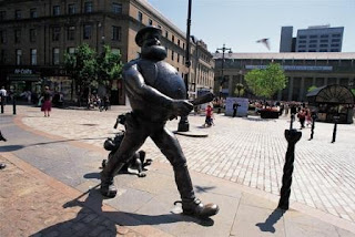
The final project is in conjunction with the new V&A museum that is being built here in Dundee. There is an architecture competition for the design and build of the museum itself and we have to design a website banner that either advertises the competition to architects or to generate interest in the project as a whole. I have decided to look at generating interest for the museum, and after some research and having been to the V&A myself I know that it is a highly thought of and well respected museum of art and I appreciate the work held within. However, I don't believe the city of Dundee to be, well let's just say as sophisticated as to have such a wonderful gallery so to get all people for all walks of life in and around Dundee I thought to use the iconic symbol for Dundee of Desperate Dan to get the people interested. Just to show that it is a museum for everyone and not just lovers of art and design. This is only my first idea and I haven't got any layouts or thoughts about how the banner itself is going to function, so I am going to run my idea past my tutor tomorrow and see what he thinks, but for now I have my tag line that reads "Even Dan goes to the V&A."


So as you can see it's been a busy first few weeks back at DOJ and my mind is definitely back in the graphic design mode and I think I have plently of work to be getting on with and to be keeping me busy for the weeks to come.....